by Elizabeth S. Craig, @elizabethscraig
Through the years, I’ve run across a lot of author websites. When I see something really useful, I’ll add it to my own. Here are five things that I’ve found worthwhile to add.
A book page for each book
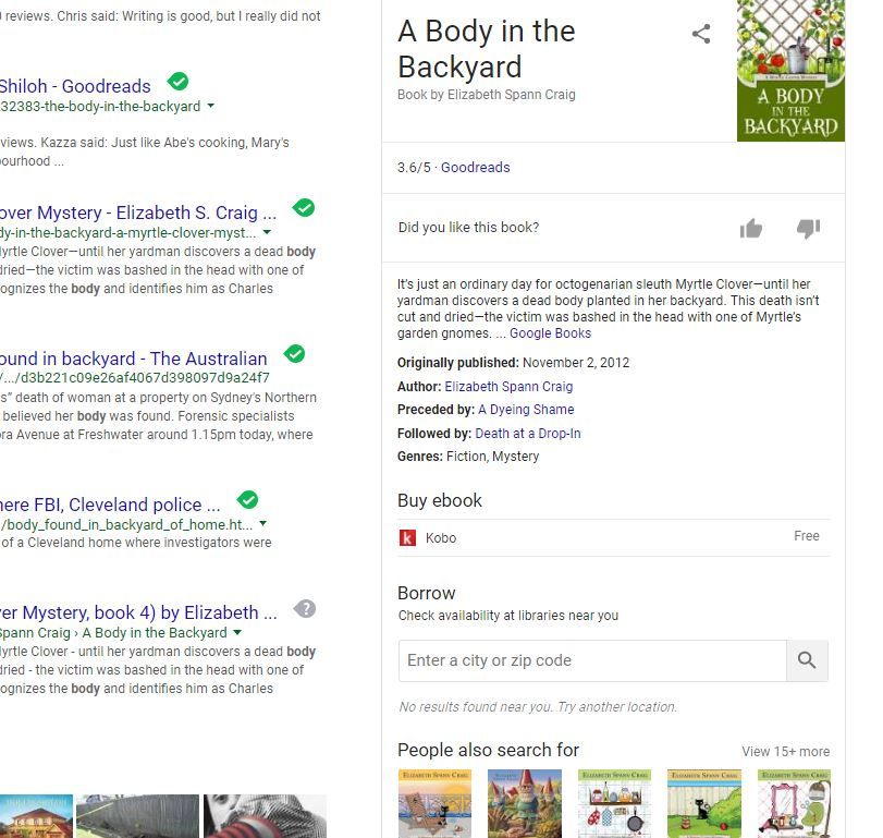
This is important for SEO for your books. If you look up my books on Google, you get ‘rich results’ in the sidebar showing the cover, ratings, publication date, my name, etc. This wasn’t the case until I had a separate page on my site for each title (I also used some schema markup on book WordPress pages to help search engines read my page elements. More on how I did that here).
A coming soon page
A reader in suggested back in 2016 that I should create a ‘coming soon’ page on my site because she kept losing track of my releases and what series was launching a book next. I’ve made sure to keep it updated (which is, of course, the danger of having a page like that).
A nice link to add to the Coming Soon page (along with other pages on our site) is a link to our Amazon Author Central page with instructions to follow us there. I just put a simple: ” Follow me on Amazon for release updates” up.
A newsletter signup
This is a frequent reason that readers visit our website–to find ways to stay updated. The easiest, and best, way to gain subscribers for our newsletter is by listing the signup info several places on our website. The readers who subscribe on our sites are most likely to be our most dedicated readers…and the most important ones to contact when we have releases. You should also have your newsletter signup on your Facebook page, if you have one.
A printable book list/your books listed in order
This was another reader request. At first, I didn’t really see a point to listing them in order because they could all be read out of order. But there are some readers who really, really want to read books in order. You can upload a Word doc or PDF to your site. The important thing, again, is to remember to update it when new books are released.
I’ve made a point, since my books are available in print from both CreateSpace and Ingram, to list the ISBNs for the books so they can be printed and ordered by readers at their local bookstore, if they wish.
Contact information
I’m sure everyone is tired of me harping on this, ha! I must note this about every six months on this site. But the number of blogs and websites that I come across that don’t even have an author’s last name or email address is really amazing. Readers do want to contact us from time to time and so do others–maybe someone would like you to speak at a rotary club meeting or would like to get in touch with you about representing your fiction, etc.. It’s important to provide a way to connect.
Do you have any of these elements on your website? What have you found useful on your own site?
Five Useful Elements for Your Website Share on XPhoto on Visualhunt.com


I have separate pages for each of my books although anthologies are all listed together.
I seem to find a lot of blogs that not only don’t have contact information, but it’s hard to find the blogger’s name as well! I would think even writers without books yet would want their name prominent on their site.
Oh gosh, you know how that drives me nuts when there’s no name. At least a first name, please! It’ll just have the blog’s title and that will be it. The ‘about me’ will say: “I’m a mom a SF/F writer!” without writing it in the 3rd person to give us some idea who they are. Ugh.
Good list. Another thing I’d add: a photo of the author. In 20 years of web design the toughest task has always always been to get women to give me their photo for their website. (Men, too, to a lesser extent, but mostly women.) I’ve encountered everything from evasion to outright refusal. When visitors see a face it makes it so much easier to build trust. Without trust, you’re just one more voice trying to sell them something.
Unless you live and die by your website sales from random Google searches, mucking about with SEO metadata and whatnot isn’t worth the time and effort to learn and implement. Google does its job well enough, and the searches that matter to an author happen on Amazon, not Google. If you want to make the most of THAT you need David Gaughran’s book “Amazon Decoded.” (Free with his newsletter signup at https://davidgaughran.wordpress.com/2018/01/19/amazon-decoded-a-marketing-guide-to-the-kindle-store-is-free/. David is the source, the only voice I trust on this topic.)
Also, and I’ll keep saying this until I shuffle off this mortal etc., a blog. A writer who doesn’t blog is begging for invisibility. (Canfield’s Corollary to the Blogging Beg: use self hosted WordPress. Not Wix. Not Weebly.)
A photo is always good! And a professional photographer makes a world of difference in terms of lighting, etc. (and is almost always no more than $100, unless you want more than one pose).
I do have a solid international audience, so Amazon is important, but not the only game in town for me. Getting readers to my website helps with the reader frustration factor since I have UBLs to help them find the book.
Blogging is the best!
UBLs? I looked, but I can’t find it.
They’re on each book page…buy button that says ‘internationally’.
Sorry; I meant, what does the acronym UBL stand for?
Sorry…that’s Universal Buy (or Book) Link. More about the one I’m using here https://www.draft2digital.com/blog/introducing-universal-book-links-next-level-discoverability-for-authors/ , although there are others, too.
Sweet merciful heavens that’s marvelous.
And free! You don’t even have to be a D2D author to use it. I’m going to write a post on it at some point.
Basically, they link here: https://www.books2read.com/u/bQrAP3 and then when the reader clicks on them, it takes them to their home country’s retail store.
I really need to take advantage of those! I wasn’t thinking about international readers, and I absolutely should. Thanks for the post, Elizabeth! Even though I have a separate page for each of my books, I just googled each one and only the first two have the “rich” results you screen shot. Maybe because they’ve been around longer?
My last book isn’t a rich result yet, but the prior one is. So I do think time is a factor. I usually try to make things move faster by tinkering with the structured data on the site (more about that here).
What impresses me, Elizabeth, is your continued generosity in sharing what has worked for you. I’ll be taking some of your suggestions here and updating my website. Thank you!
Thanks for the kind words and good luck with your website update! Have a great weekend. :)
These are really good ideas, Elizabeth. All of them make a website appealing to readers, but also increase the chance of sales (without being annoying about it). I also think it’s important that readers can navigate around the website easily. If a reader has to do too much work to find a list of books, or the description of one of the books (or anything else, really), I think you have the potential to lose that reader.
Navigation is also key! Good reminder. We shouldn’t make it difficult to find information.
Since my personal website focuses on me as a speaker, I’ve used the extra pages for speaking topics instead. (And now I’m out of room unless I want a huge upgrade.)
Ack! That can happen. Can you just link to the speaking topics on Google docs from a single page on your site? Or have them set up as PDFs on a page?
Good information as usual, Elizabeth. But you’ve just increased my “To Do” list exponentially!
Sorry about that, ha! Yes, there’s always something else to do, isn’t there? Hope you have a good weekend!
SO true on the contact page, Elizabeth! I’m so glad you’ve brought that up. There have been many times I’ve wanted to invite a writer to be featured on Writing and Wellness and then had to abandon the idea because I couldn’t find a way to get in touch with the person. I wonder then how many other opportunities they miss out on for failing to provide this one thing. Contact form or email address—so important!
It’s the most important thing about the site! So hard to understand why it’s so frequently neglected.
Hi Elizabeth – wonderful comprehensive ideas here. Someone wanted to contact me – when I first started blogging … no contact info – she then wrote a blog post to me on her blog!! That set me thinking … so I opened the door with contact details. Thanks – administration kept up to date is essential for us all … cheers Hilary
I think it’s something that many people forget about or feel is unimportant…too funny that she contacted you via her own blog, ha!