By MiblArt – book cover design company for authors, @miblart
Speaking from experience, creating cozy mystery book covers is a lot of fun because of how unusual the genre is. The name itself implies an odd contrast: Mystery is all about tension, suspense, and often death, while cozy is something warm, fluffy, and pleasant.
It means that every cozy mystery book cover is a little challenge — a balancing act to display the warmth of familiar and imply the suspenseful mystery of unfamiliar. So, what makes these covers tick? Let’s take a look at cozy mystery book cover design tips, trends, and examples to figure it out.
Cozy Mystery Target Audience
A cozy mystery book cover design is first and foremost a marketing tool. And an effective marketing effort starts with target audience research.
Based on this Facebook ad targeting research, a cozy mystery audience is
- Mostly female (85%);
- Majority over 40 yo;
- Highly-educated with jobs in administration, education, and sales.
Such a TA is a mature and experienced one. They definitely know what they want from a cozy mystery book — an escape into a world of elaborate puzzles and intrigue that leaves out the graphic details for the sake of pure enjoyment. Such stories should be driven by interesting, strong, and intelligent characters that can grow and change.
So, what book covers would such an audience prefer?
Cozy Mystery Book Cover Design Trends
Let’s take a look at the current market as it reflects the audience’s demands. Currently, we’re witnessing the following cozy mystery cover design trends.
Illustrated Covers
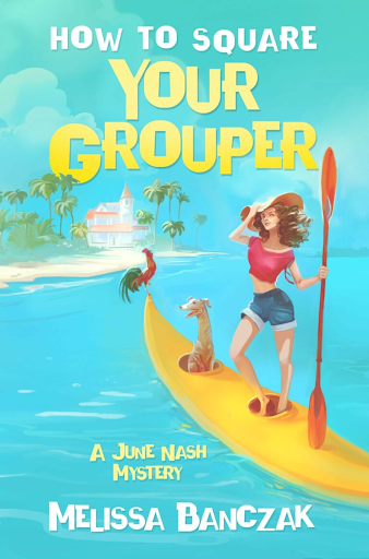
The first thing that comes to attention is that the majority of cozy mystery covers are illustrated.
We think one of the main reasons for illustration’s popularity is that such hand-drawn art is whimsical and, well, cozy. There’s a certain quality to the illustrated design that’s difficult to replicate.
Bright colors
Expectedly, cozy mystery covers prefer bright color palettes. They don’t want that gritty moody look traditionally associated with crime novels. You can also see dominating pastel hues on some art, but the hues feel tender, not mute.
Lots of pets
There are a lot of pets, in particular dogs, on the covers. There isn’t much to say here: Pets are great, cute, and fluffy. What says “cozy mystery” more than a loyal fluffy detective partner with a sharp sense of smell?
Lush fonts
As in every genre, there’s a fair share of minimalistic fonts on cozy mystery book covers. But, the dominating consensus is with elaborate, intricate fonts that feel big and charming.
Dense with detail
Often, the covers feel just like a detective mystery itself. There are plenty of details and little clues you’re trying to piece together to get the feel of the story and its plot.
Rarely focused on character
Though interesting characters are at the heart of cozy mystery novels, the book covers rarely focus on them. Occasionally, it may feel like we’re assuming the POV of the protagonist, observing the city, old house, cozy cafe, or a room filled with pleasant light and warmth. But rarely, the covers depict the face or figure of the character.
Cozy Mystery Book Cover Design Tips
It’s for you to decide whether you want to follow current cozy mystery cover trends or try different approaches. Regardless of your choice though, there are a few tips that can benefit any cover.
Make the covers cozy but don’t forget to hint at suspense
The best cozy mystery covers double down on the cozy while hinting at the suspense. Such an approach creates a very specific feeling that is unique to the genre.
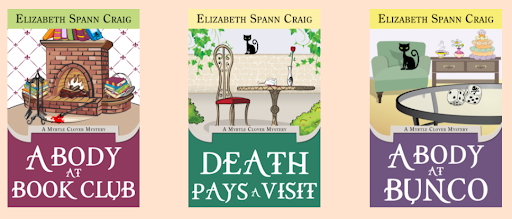
By useful coincidence, a great example of such covers is Elizabeth Spann Craig’s A Myrtle Clover Mystery. The covers of the books paint beautiful, welcoming pictures… If not for drops of blood here and there, a spilled glass of wine, or a skull on a dice. These tiny eerie details don’t completely override art’s pleasant vibe but imply “something went horribly wrong here; let’s figure it out!”
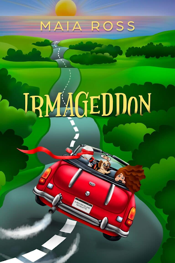
There are many ways you can go around and about creating these subtle contrasts. For example, you can take a more direct approach and leave all the heavy lifting to the title/subtitle while the artwork is clean of any thrilling details. Or you can build tension with dynamic scenes. For example, take a look at this chase on the cover of Maia Ross’s Irmageddon.
Cover designed by MiblArt
Pick a font that suits the feel of the cover
We suggest picking fonts that feel like a continuation of the art. If, for example, a cover depicts an old house that is perfectly strict in its geometric perfection, a suitably geometric font will do the cover justice. A nice example is Deck the Hallways by Kate Carlisle. The typography feels like woodwork itself — slightly rough, but beautifully precise and angular.
On the opposite side of the spectrum, there is Lavender Blue Murder by Laura Childs. The artwork is lush, blooming, and exquisite; so is the font.
Usually, if the cover is full of detail, we advocate for minimalist fonts without embellishments and extra curves for better readability and contrast. With cozy mysteries, we refrain though. And Lavender Blue Murder shows why: A lush font looks gorgeous and it works for the genre like a charm.
Use familiar color palettes
Color is a king, queen, a royal family, if you will, of cover design. Even if people don’t realize it, emotion lives within each hue. That’s why it’s so important to pick colors that send a proper emotional message.
In the case of cozy mysteries, we also suggest picking color palettes that are intimately familiar to your audience. Extra points if the colorwork feels particularly nostalgic.
Do you know that scene from Pixar’s Ratatouille when the cynic critic remembers what it’s like to be a sincere and happy kid because of the oh-so nostalgic taste of the dish? Ideally, you want to evoke the same feelings of painful but beautiful longing in your audience.
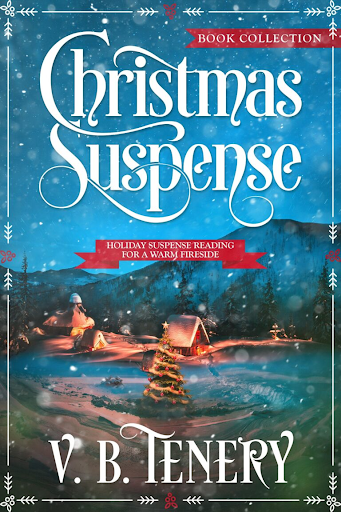
A great example of a cozy mystery cover that pulls it off is Christmas Suspense by V. B. Tenery. You can hardly find a person who wouldn’t resonate with the art and colorwork of the cover.
Cover designed by MiblArt
Have Fun
Often, the hardest person to please is yourself. It’s especially difficult when you’re working in tandem with another artist. Our advice here is don’t limit yourself to perceived conventions, don’t be afraid to try different things, and experiment with ideas. In other words — have fun. If you’ll have fun working on a cover, chances that you’ll love it are much higher. Besides, the fun is infectious; the readers will feel it.
Cover designed by MiblArt
Summing Up
A cozy mystery is a delightful and very interesting genre to work with. It offers a lot of space for creativity, experiments, and unrestrained fun. Besides, the genre is constantly evolving, and we can’t wait to see how you will continue pushing its boundaries in both storytelling and cover design.
MiblArt is a book cover design company for self-published authors. We design covers that turn into your best marketing tool.
Tips from @miblart for cozy mystery cover design: Share on X
Photo credit: Tom Carmony on Visualhunt
Thanks, Helen! Fantastic tips here, especially the importance of fonts (and pets, ha!)
Hi Elizabeth – fascinating post by MiBli art – did they help design your covers, and did you set out with the idea of creating a series – and thus an early branding for their future? Fun and interesting post – thank you … cheers Hilary
They didn’t help me, but I do love their covers! As for my covers, it was tricky, ha. I started out with trad-pub with 2 of the series and the designer for the publisher set some of the branding. When I took it indie, my designer, Karri Klawiter, had to mimic the style without violating the copyright. She did a good job!
Most cozy mystery covers are fun. And yes, many do feature an animal.
Lots of animals on those covers!
Those are some awesome covers. Bookmarking the cover creator for later!
Hope it helps, Elizabeth!
Cover designs can be really important, and we don’t always think about it. Thanks for these ideas!
Thanks for coming by, Margot!
Excellent tips! Cozies have such a distinctive style – fun with that hint of murder. Fun :)
Distinctive is right, ha! Thanks for coming by, Jemi!
Getting your cover to announce a book’s genre can be a challenge sometimes. I’ve been searching through hundreds of urban fantasy books, trying to figure out what should be on my cover. Thanks for the post.
That’s a big chore, Ken! But you’re smart to approach it that way. Good luck!
This post was very interesting. I don’t make my own covers, but it gave me an insight as to what my designer considers when she makes my covers. I love her work and now I know the reasons why.
It’s interesting to see what goes into the process, isn’t it? Thanks for stopping by, Carol!