by Joanna Fitzpatrick, @Fitzpatrick_jo
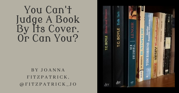
The long and short of it is: how do you come up with a compelling 5.5″ by 8.5″ book cover suitable for a bookstore window (if you get that lucky) and which is also suitable when reduced to a postage stamp image digitally displayed online, which is where most books are seen and sold today?
Before I became a writer, I designed LP record jackets. For any one of you who have ever lovingly held an LP in your hand, admired its “artwork,” and then slipped the disc out of its sleeve, placed the turntable needle on the rim of the black vinyl recording and sat down to listen while reading the liner notes on the back of the jacket – let me just say “those were the days.”
When CDs (4.75″ square) and Cassettes (smaller than a smartphone) arrived on the music scene it required a very different creative approach because there was little room for artwork, liner notes or even space to list musicians. And today, just like books, most “albums” are sold digitally by displaying a postage-stamp size cover with limited information.
Okay. So we are aware of the limitations of today’s cover artwork, be it book covers or album covers, but there’s a lot you can still do to have a terrific cover IF you have an art designer willing to work with you as I do. But be respectful of their time. They have to produce hundreds of covers under deadline. In other words, show diplomacy: speak softly and carry a big stick!
But first you need an engaging book title. My original title for “The Artist Colony” was “The Sketch Box.” I called it “The Sketch Box” because I needed to have something to call it other than “the book” or in my darkest hour “the beast.”
A sketch box is an artist’s box carried by plein air painters, like a briefcase, with the art supplies needed to paint outdoors. Only painters would know this and it wouldn’t conjure up any intrigue to read it. It’s what’s called, let’s face it, a “bad title.” My novel was an historical mystery not a how-to-paint book. Working titles are often wrong, but we get attached to them, like our darlings that we later edit out of of our books or our editor does it for us.
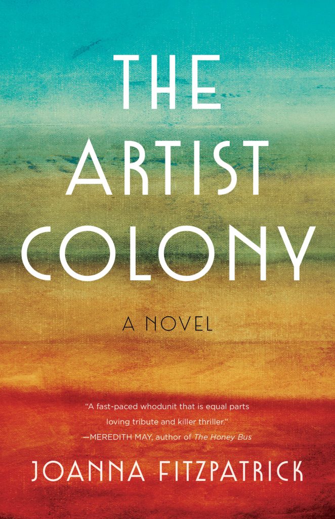
I knew I had done the right thing when I changed the title to “The Artist Colony” because images immediately came to mind for a book cover.
My novel is about two sisters who were artists. Ada Belle dies under suspicious circumstances and her sister Sarah becomes an amateur sleuth to find out the truth. I sought online for an image of a messy painter’s palette covered in thick, oily globs of glossy black and blood-red paint. I found just such a palette on internet and proudly sent it off to my publisher’s art department.
The designers reviewed my ideas but the mock-ups they sent back showed me that they were designing a generic cover based on their concept of what a historical mystery was. Obviously, they hadn’t read my book. How could they have the time! Does this sound familiar? The reality of working with a commercial book publisher has to be overcome.
I wrote back and said politely that if they wanted to have an image of two sisters then show them as they really are in my story: stylish Manhattan female artists who would be found at a speakeasy or a bohemian garden party wearing peacock feathered hats, flamenco shawls and stilettos. Not frilly pastel dresses that were worn by the sisters in the movie “Little Women.” Historical, yes, but inaccurate and where was the mystery?
All was not lost. They had come up with another mock-up from one of my other cover ideas that I liked a lot. It was a painting of a seascape that had texture like a painter’s canvas. And they’d come up with a stunning 1920s art deco font for the title that fit the time period. Yay! We were getting closer. Only the story’s plot was missing. A plot that would sell my book through it’s compelling cover.
I gave the designer my elevator pitch: “The Artist Colony” is a page-turner story of bohemian artists, rum runners, racial unrest, suicide, art forgery, and dead bodies found in a bucolic1920s art colony.
Since they would never read the book anyway, that seemed to be just what they needed. The next seascape mock-up was dramatically darker and foreboding. The only change I then requested was to enlarge and brighten the title font and my name for stronger visibility. Remember we are talking about a miniature image. The designer did as I asked and voila! we had a cover. At first I thought this will never happen but at the end I was happy.
I’m a big fan of well-designed book covers. I’d love to hear from other writers as to how they designed their book cover or from readers who may have bought a book because of its cover.
And, of course, I would be curious to know if you think my book cover accomplished what I was looking for or not?
JOANNA FITZPATRICK was raised in Hollywood. She started her writing habit by applying her orange fountain pen and a wild imagination to screenplays, which led her early on to produce the film White Lilacs and Pink Champagne. Accepted at Sarah Lawrence College, she wrote her MFA thesis Sha La La: Live for Today about her life as a rock ’n’ roll star’s wife. Her more recent work includes two novels, Katherine Mansfield, Bronze Winner of the 2021 Independent Publisher Book Award (IPPY) in Historical Fiction, and The Drummer’s Widow. The Artist Colony is her third book. Presently, FitzPatrick divides her time between a cottage by the sea in Pacific Grove, California and a hameau in rural southern France where she begins all her book projects. Find her online here:
Author website: www.joannafitzpatrick.com
Facebook: www.facebook.com/JoannaFitzPatrickauthor
Twitter: https://twitter.com/Fitzpatrick_jo
Instagram: https://www.instagram.com/joannafitzpatrick.author/
Tips for Giving Input to Your Cover Designer by @Fitzpatrick_jo : Share on X
Photo credit: erix! on VisualHunt
It seems like it would be hard to design your cover without reading your book and knowing what it was really about. Glad you kept sending their proposals back till they got it right. Love your cover!
Hi Natalie, Yes, it always helps if the cover designer has read at least part of your book but they just don’t have the time. I think visual samples are also helpful though you don’t want to copy somebody else’s cover! Thanks for commenting. It’s so supportive when your words are heard or your cover is seen and “loved”!!!
I’ve been very pleased with the covers for my books. My publisher’s artist usually picks a scene and works with it.
Hi Alex, I think that is a very good idea for the publisher’s artist to pick a scene from your book. Do you suggest the scene or do they come up with the scene on their own?
Thanks so much for the post today, Joanna! Your background probably gave you the confidence to know exactly what would work for your genre. Covers are so important that it really makes sense to get *exactly* what you’re looking for.
Hi Elizabeth, And thank you for publishing my article! I hope it is helpful to other authors. Yes, my background helps a lot when I have to work with publishers. And to get it “exactly” right is so important, particularly in today’s book market when you only get to display tiny covers. It is also so important not to overload your cover with too much information! As Van Gogh famously said: “Exaggerate the essential. . .leave the obvious vague.”
So cool that you designed record jackets. I LOVE your cover for The Artist Colony. It had to be frustrating that the designers were not getting it right.
Hi T. And it’s so cool that you LOVE my cover! Thank you. And yes it was frustrating but so exciting when they got it right!
With Dancing Lemur Press, we spend time trying to find just the right elements to put on our book covers, because it does really matter.
Hi L, It is good to hear of a Press that spends dedicated time on its covers. I’d like to know more about Lemur Press if it is that creative and efficient. Not many Presses can say that. Send me some samples of your covers!
Thanks for sharing your experience. I think a major point here is how important it is to communicate really well with the cover artist. To me, that’s one important factor in choosing the person who’s going to do the covers for my books: how well does that person communicate? As you say, the cover does matter, so I think it’s worth thinking it through carefully before choosing the artist.
Well said, Margot. And may I add that it is also important for you, the author, to find a way to communicate with the designer by showing them samples of other covers you like and then talk, talk, talk. Also look at samples of their other covers to see if you are on the same page.
Really enjoyed this piece, Joanna – it’s so interesting to see how you guided the publisher to a cover that was perfect for the job. I shudder to think how their first attempt must have misrepresented the book, and how it might have gone to press like that if you hadn’t convinced them otherwise. The Artist Colony looks terrific – the image is timeless and suggests modern reader sensibilities, and the font evokes the period.
I think it’s incredibly cool that you designed album covers – and very interesting to hear how the aesthetics had to change when CDs came in. My latest novel needed a cover that looked like a music album. I wished the book could be square, but I found a design that got the message across.
Why thank you, Roz. I put a lot of thought into my articles on writing and always appreciate hearing from someone that got what I was saying. I thought to show some samples of what my publisher did come up with at first but I didn’t want to embarrass them. Great idea using an album cover on your cover. I’d like to see it. Is the book about musicians. I published a book called “The Drummer’s Widow” and it was all about the music biz, my most autobiographical novel. The cover was a drum set.
Hi Elizabeth, and Joanna – who had an amazing upbringing – yet used her skills to learn more … even the knock-backs haven’t stopped her creative spirit. I do love appropriate book covers … your colours would draw me in … I’ll keep my eye open for your books. The cover resonates the heat of an artists’ colony … and I love it. All the best to the both of you as the year draws to an end. Cheers Hilary
Thank you for the good wishes. It’s been a tough year for so many of us. I have big hopes for 2022. And thanks for noticing my creative spirit! Don’t know how I’d go on without it. My book is available in bookstores and online. I prefer when readers buy in the bookstores as I don’t want the stores to disappear like what happened when LPs died. Unfortunately bookstores are following a similar trajectory. And yes there was a “lot of heat” in my fictional artist colony.” Best wishes to you too for the New Year!